Bilbao: getting to know Frank Gehry’s Guggenheim
Posted on 23rd December, 2014
Earlier this month, my husband and I spent a few days in Bilbao. It wasn’t a city that we knew very much about but it seemed the perfect fit for our criteria for a pre Christmas break - somewhere easy to get to (direct flight from Manchester), with plenty to see and do but unlikely to be overloaded with tourists, where we we could get a great value break and, above all, looked to be supremely photogenic.
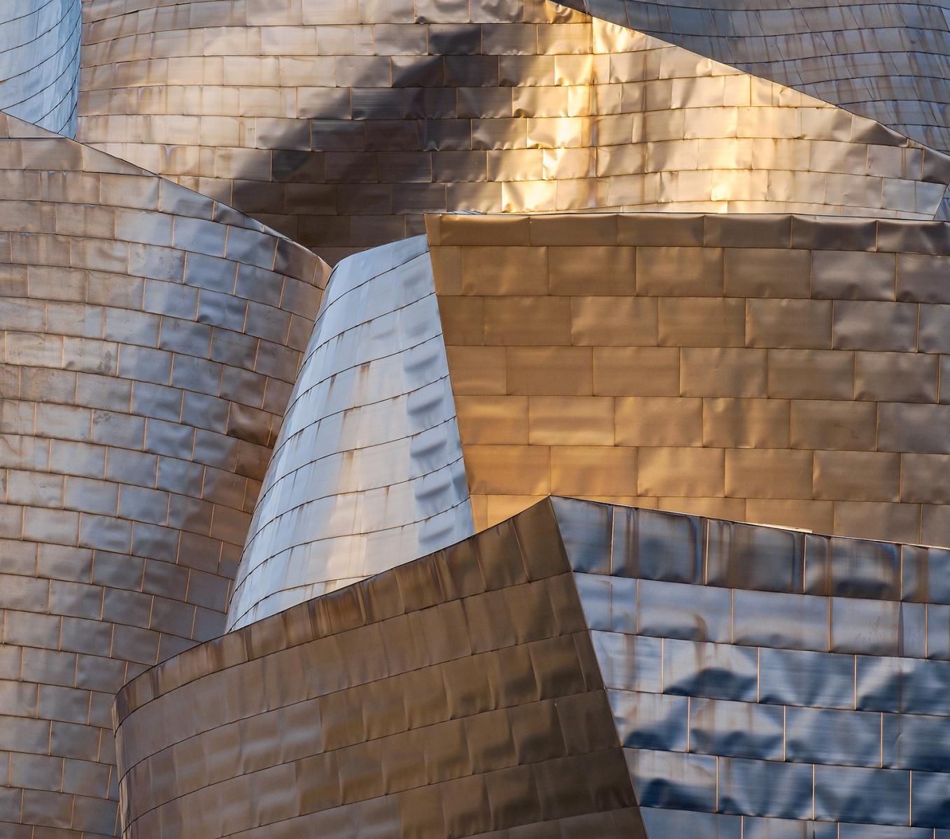
I’m happy to report Bilbao met all those criteria, and even exceeded our expectations. In fact, I loved it so much and found so much to photograph (as my poor long suffering husband will testify!) that I have felt unable to cover our trip in just one blog. So for this, my first, I am going to concentrate on the undoubted jewel in the crown - the Guggenheim building. Our first sighting was just as we jumped off our bus from the airport, catching its titanium exterior sparkling in the dying winter sun. Definitely a moment to bring out the telephoto lens and zoom in close for an abstract of those wonderful lines and curves!
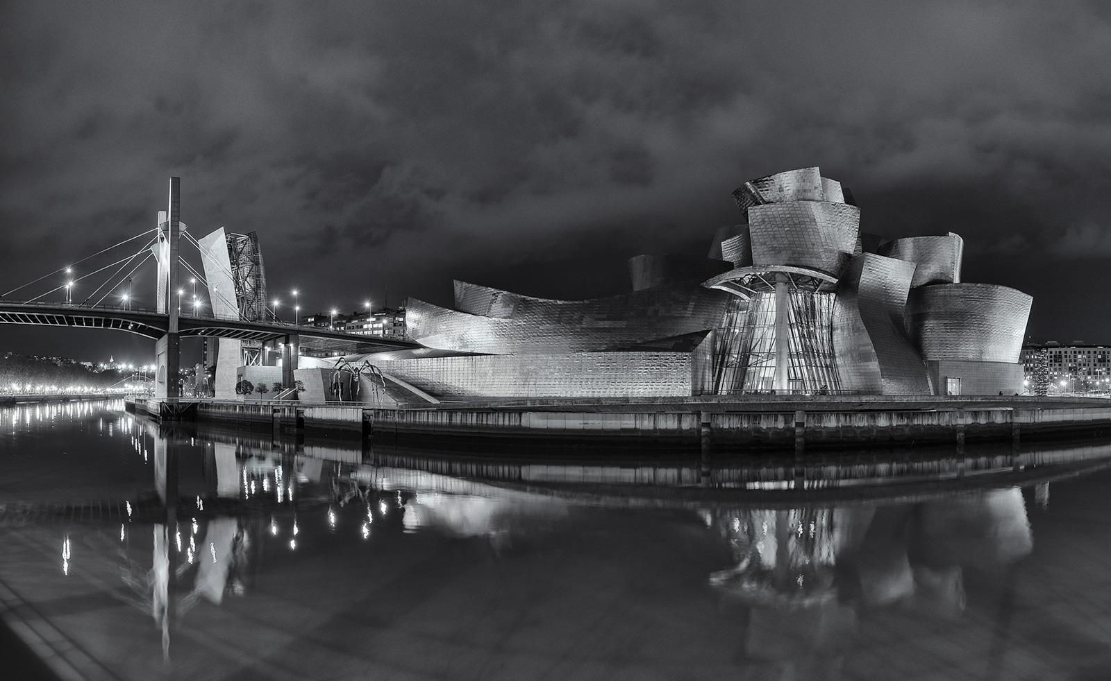
Over the four days we had there, I had plenty of opportunity to explore both the exterior and interior of this magnificent building, designed by the American architect Frank Gehry, and built between 1993 and 1997. Its wonderfully sculpted and organic form, and the combination of sheet titanium, limestone, steel and glass, was something I found completely mesmerising. I could probably quite happily have spent four days just photographing this!
I had decided to travel very light, partly so we could fly with just hand baggage, but also because I know how wearing it can be walking around a city, even without a heavy bag on your shoulder. All of my Fuji gear can fit into my little f-stop Shibata camera bag and it saved my back and shoulders from too much grief! I know camera and lenses are more than up to the job, so that makes the decision to travel light all the easier. I also brought my Reged travel tripod and a selection of filters - in the end I barely used the filters.
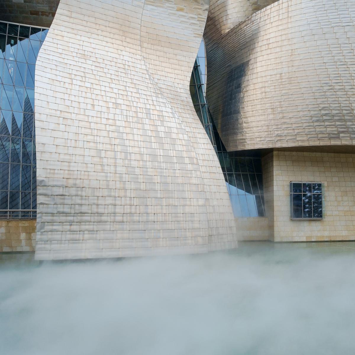
At various intervals throughout the day, fog is generated at the base on the Guggenheim - this adds a wonderful dimension to an already intriguing building - you don’t have long to work with it though - the pumps run for what must be less than a minute!
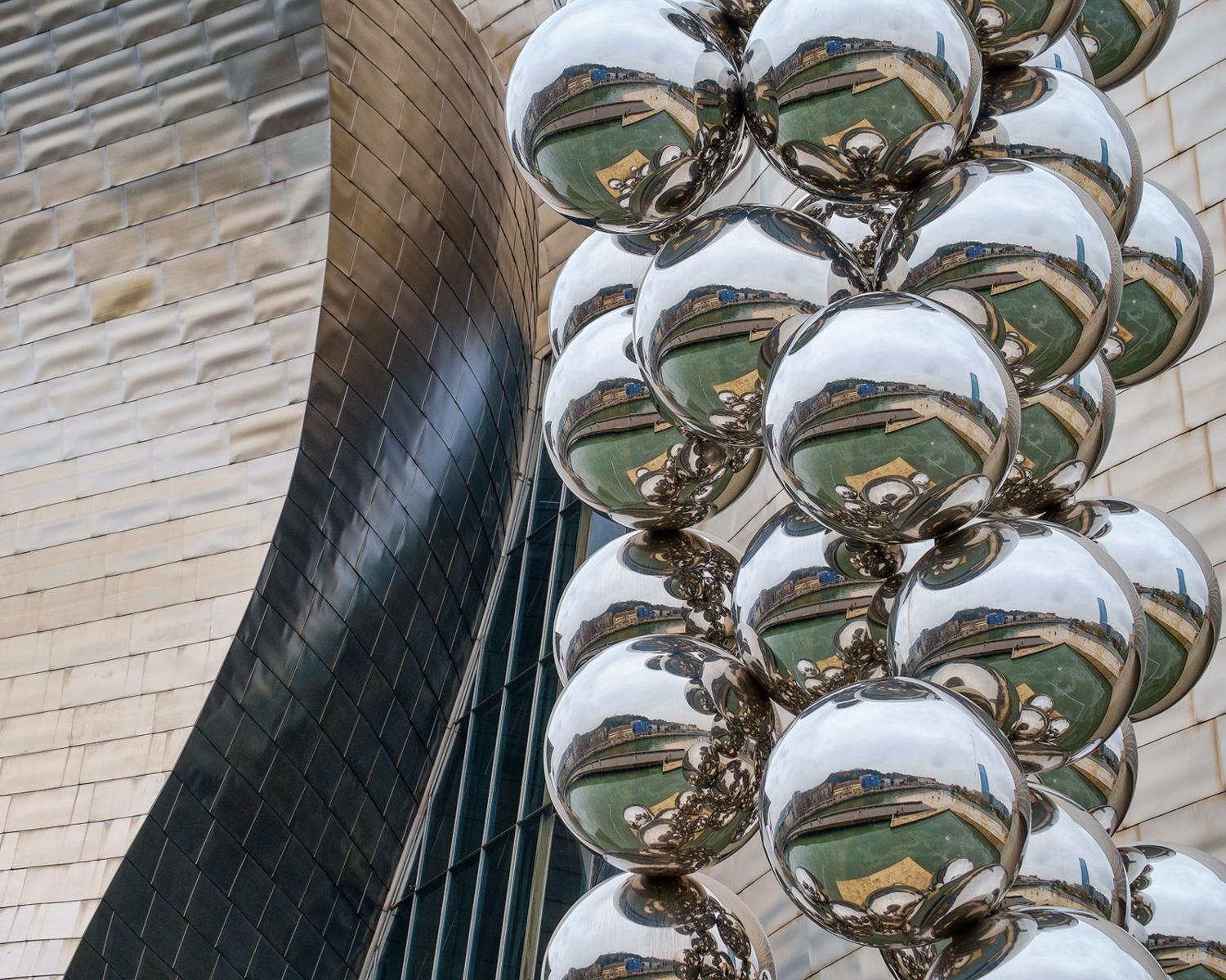
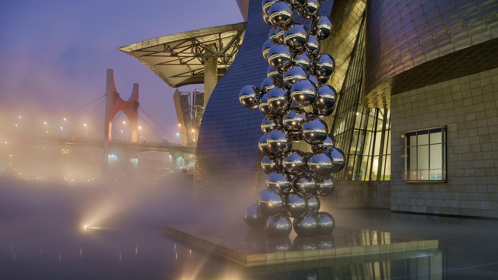
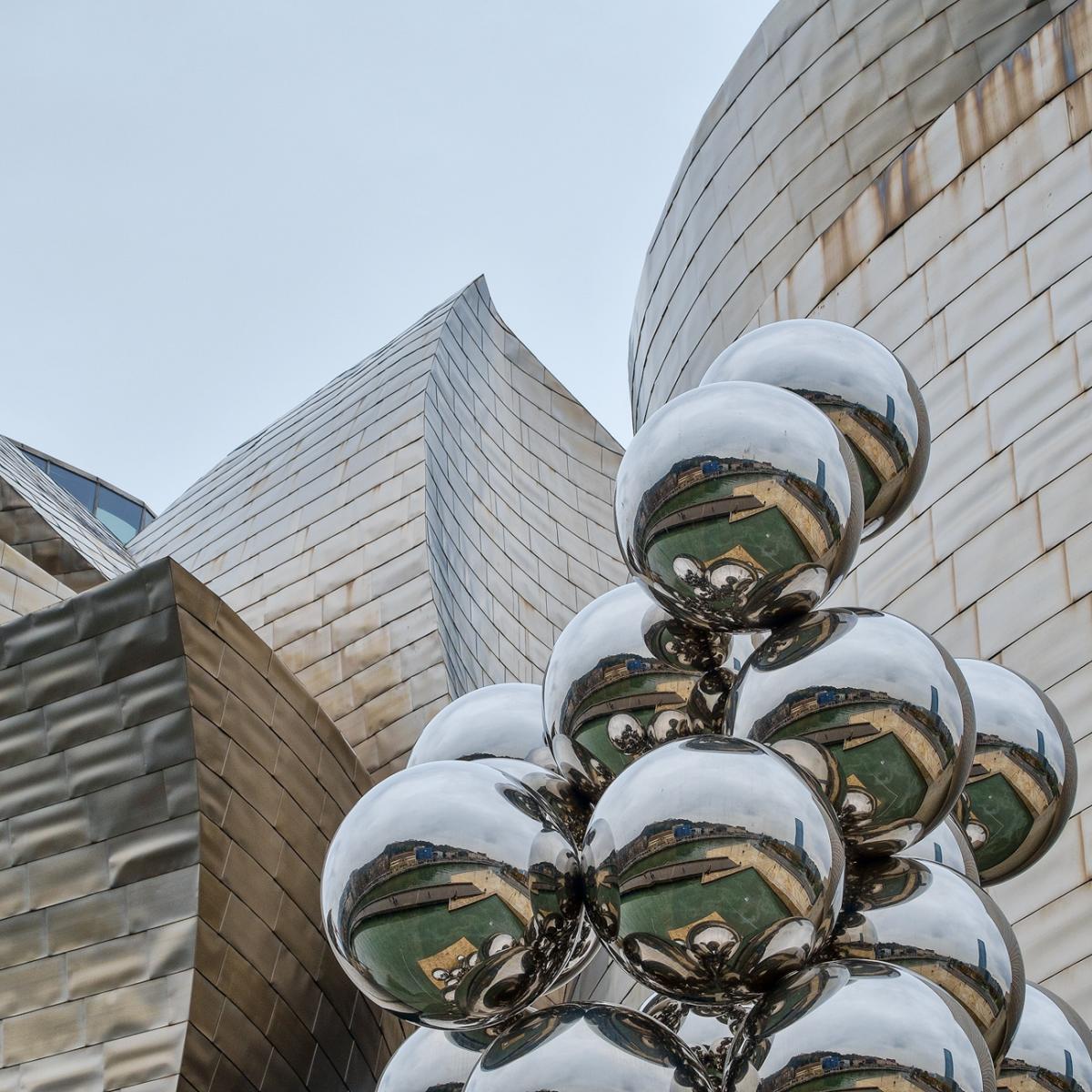
Anish Kapoor’s vast steel sculpture is one of the focal points on the riverside edge of the Guggenheim. Again something that offers great scope for the photographer and, for me, something that lends itself to more abstract compositions, rather than showing it in its entirety - although this approach probably does make its title that much harder to appreciate!
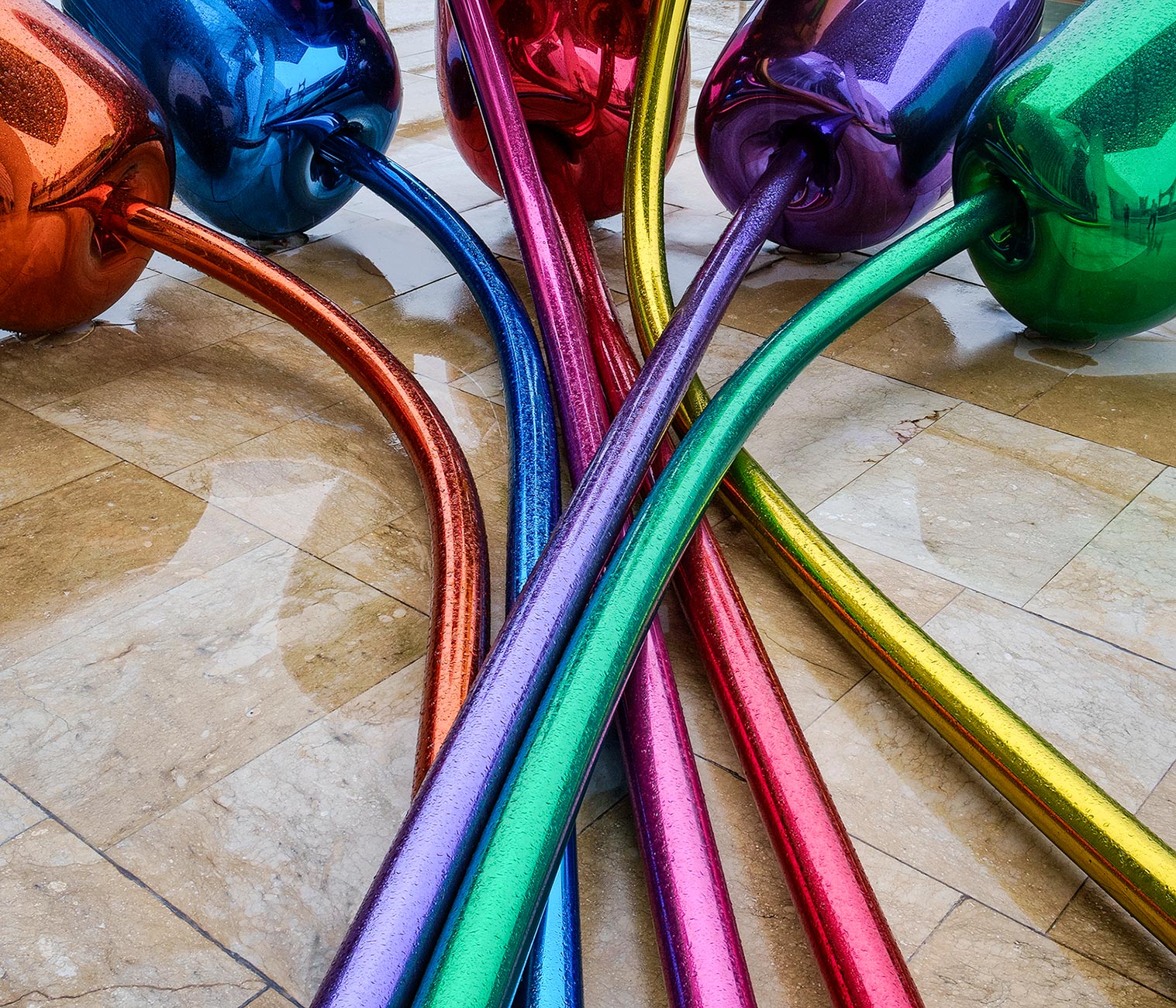
No doubt about the most colourful sculpture outside the Guggenheim - although you can only get at this one by going inside the museum and out onto a low balcony area - a collection of giant, bulbous tulips by Jeff Koons. It was raining fairly heavily at this time and my photographic options were therefore somewhat limited but, again, this sculpture offers plenty of scope for us photographers!
I have to say we were expecting to be underwhelmed by the inside of the museum - both in terms of exhibits and the interior architecture. How pleasantly surprised we were! I have to disagree with the many more negative comments I have read and heard, although that’s not to say everything in there struck a chord!
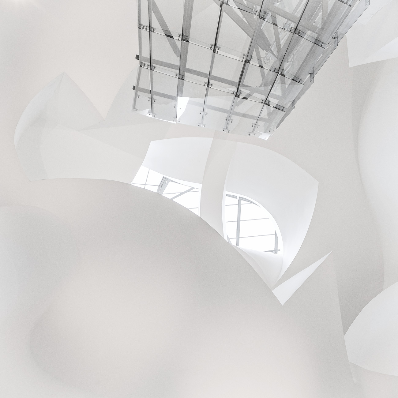
The combination of contours and materials was bewitching! Even I can’t work out the crazy shapes above, despite being the one to take the photograph! It wasn’t always entirely clear what was above and below limits, photographically speaking - by the end of our two hours or so in the museum, I came to the conclusion that any part of the building was fair game, works of art weren’t. The trouble is, it wasn’t always entirely clear where one began and the other ended!
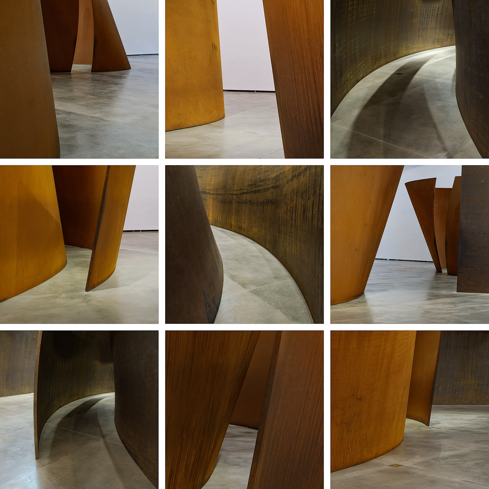
I think we can take it as read that I probably was not meant to photograph the stunning and impossibly large steel sculptures by Richard Serra - although I genuinely did not realise this at the time and no-one tried to stop me. These huge installations are set up in an enormous room and visitors are free to wander amongst them - you can explore the various spirals and, for me, they are one of the highlights of the collection there. I wanted to photograph them from above to give a sense of scale - but this is when I was stopped, and when I therefore realised that perhaps I’d not been meant to take photographs whilst walking amongst them either!
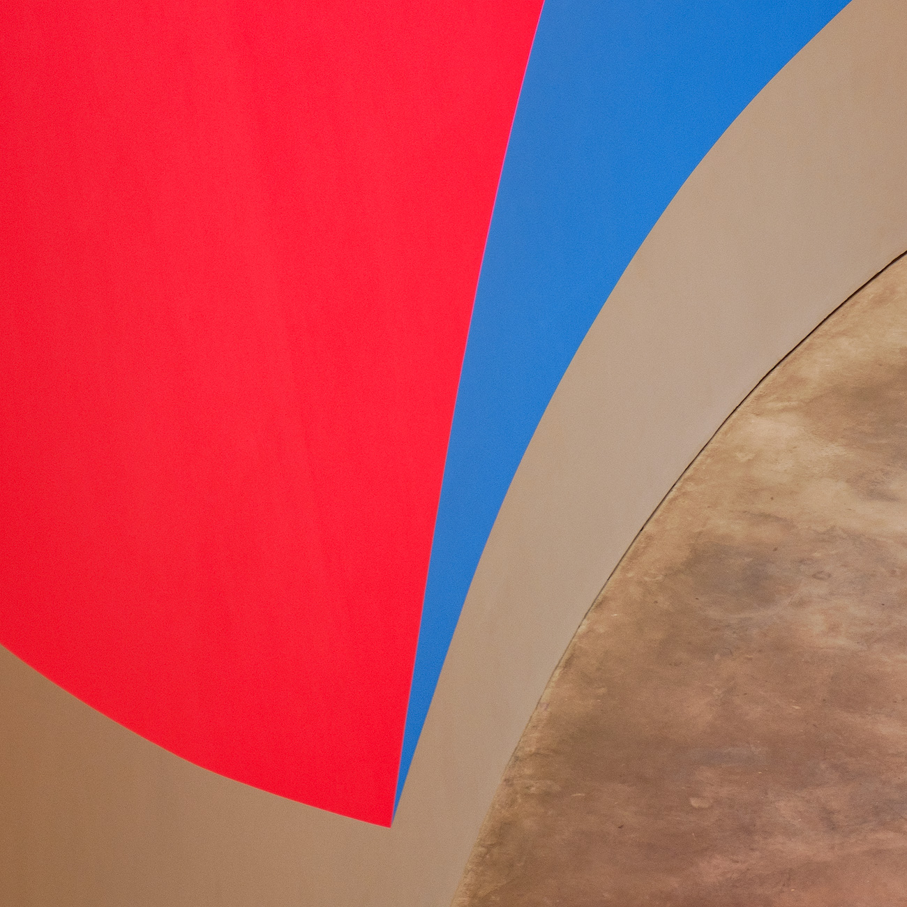
Likewise these vivid blocks of colour painted on the walls of one of the rooms on the ground floor - here photographed from above and a bit of a visual tongue twister! Not for the first time that weekend, I found myself thinking back to David Ward’s fascinating talk on colour at the On Landscape conference at Rheged. This colourful display really did play tricks on your eyes!
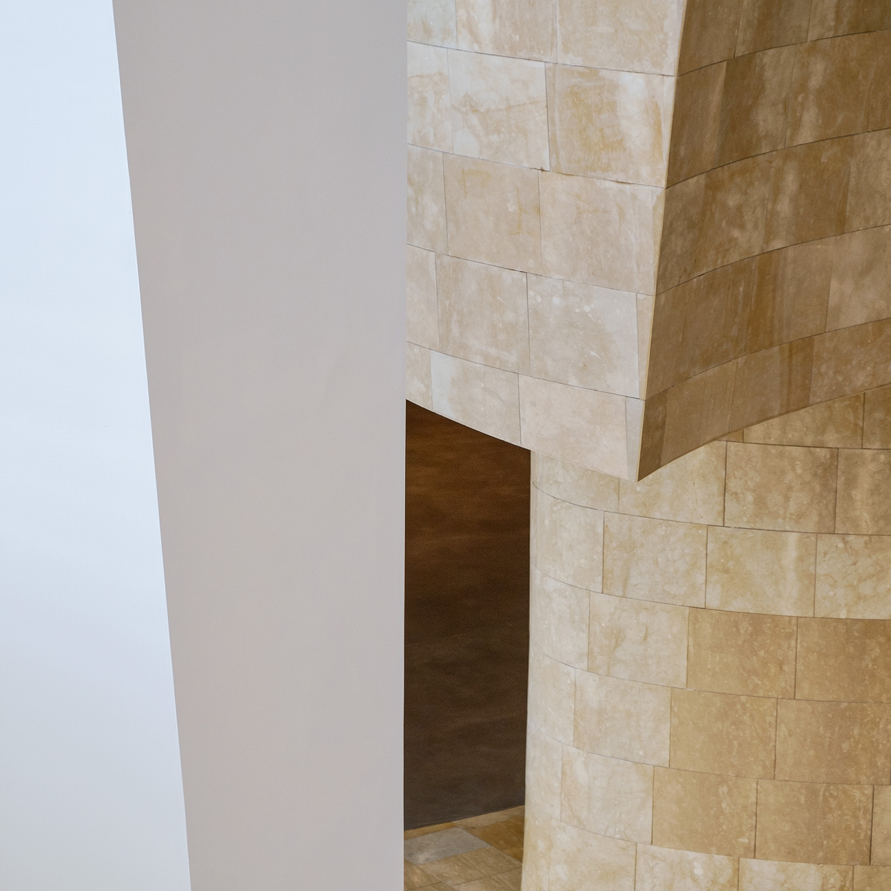
For the most part, though, the interior of the Guggenheim is very easy on the eye - a wonderful mix of soft curves and hard lines. The art on display is, as you’d expect, a mixed bag - and the extent to which you will enjoy it will depend on your taste. I loved seeing some old favourites by the likes of Kandinsky, Picasso, Chagall, Miro et al, on the top floor. Another highlight was the work of Anselm Keifer - I have to confess I’d not even heard of him previously - but what an incredible artist! The depth and textures of his work were extraordinary - eerily beautiful.
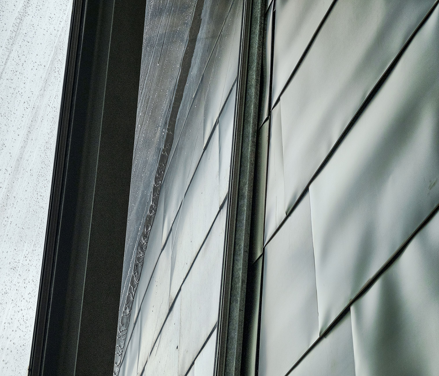
There’s plenty in the museum to enjoy and other things best walked past! I’m afraid I’m always a sceptic when it comes to reading the ‘blurb’ that goes with much modern art and have learned I usually enjoy it best if I’m left free to come to my own conclusions about what I am looking at - sorry if that makes me a philistine! Whatever your tastes, though, I defy anyone not to enjoy the extraordinary juxtaposition of materials that make up this fabulous building - those of you who enjoy abstracts will have a field day! If you’re lucky enough to catch some rain as I did - and the probability is high - then all the better!
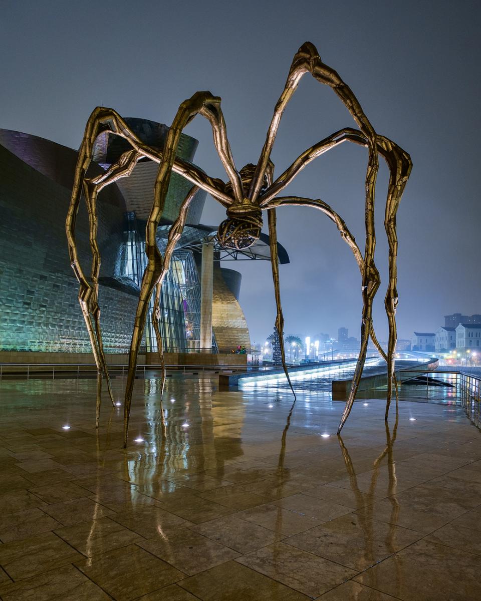
Our day of museum visiting was a very rainy day, and this transgressed into the evening. For me, that meant forgetting how tired I was and going out again in to make the most of what were perfect conditions for a bit of urban, nighttime photography. Rob, not surprisingly, opted for the ‘staying inside the hotel and reading a book’ option and so I had to do battle with the elements on my own, juggling camera gear, tripod and umbrella as best I could. Louise Bourgeois’s amazing giant (c. 9 foot) spider was a great candidate for these conditions - I was a bit bemused by its title until I read that it is a tribute to her mother who was a weaver - think laterally…! It’s a photo that requires a few compositional compromises and working out how best to place spider versus building was particularly challenging in the now pouring rain!
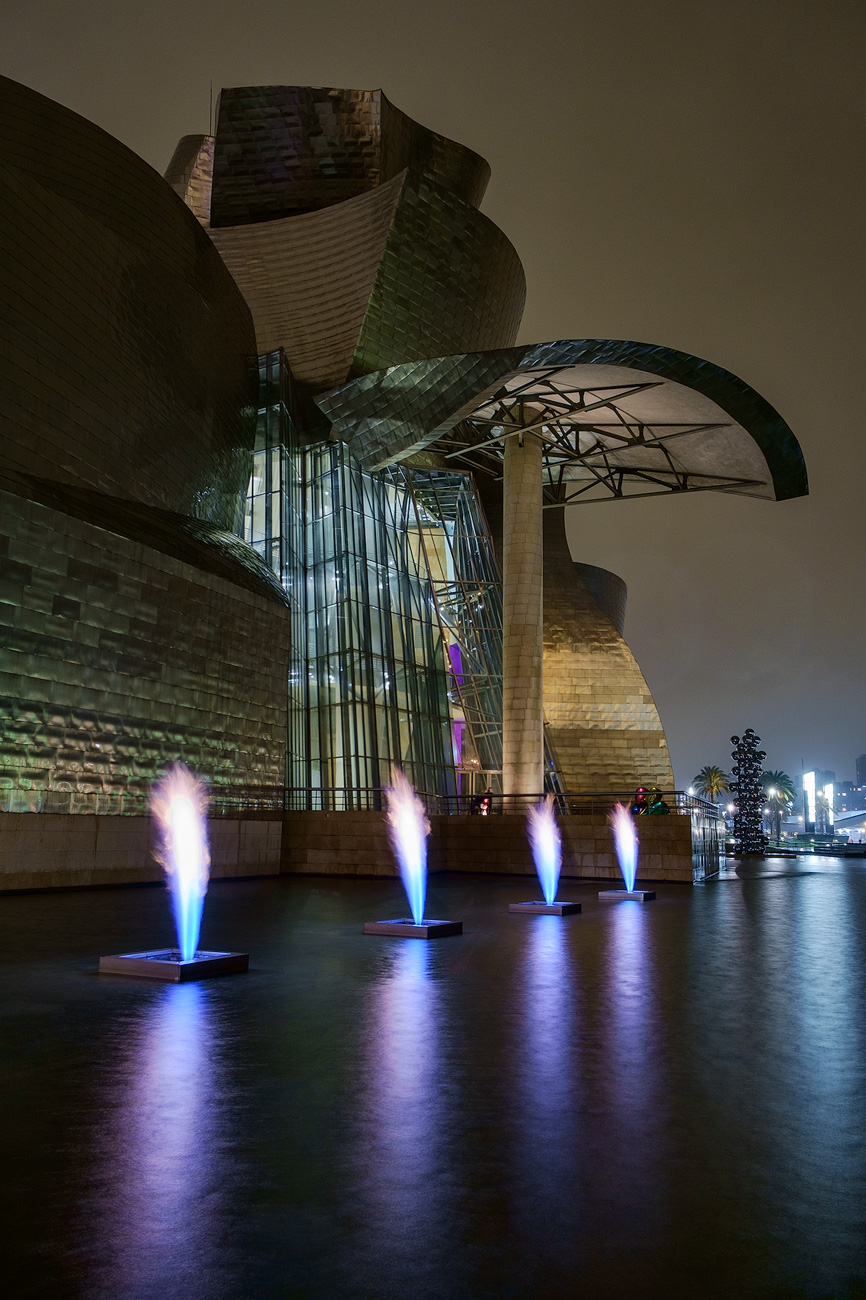
There’s a second sculpture, or installation, outside the Guggenheim that relies on the elements to play their part - the Fire Fountain was conceived by artist Yves Klein a year before his death and 25 years before it was put in place here - the idea being to have streams of fire dancing above water. The fires burn at fairly regular intervals and for a good 30 seconds I’d estimate, so it’s something that’s quite easy to photograph if you get set up in advance and wait your time. All part of the fun and madness!
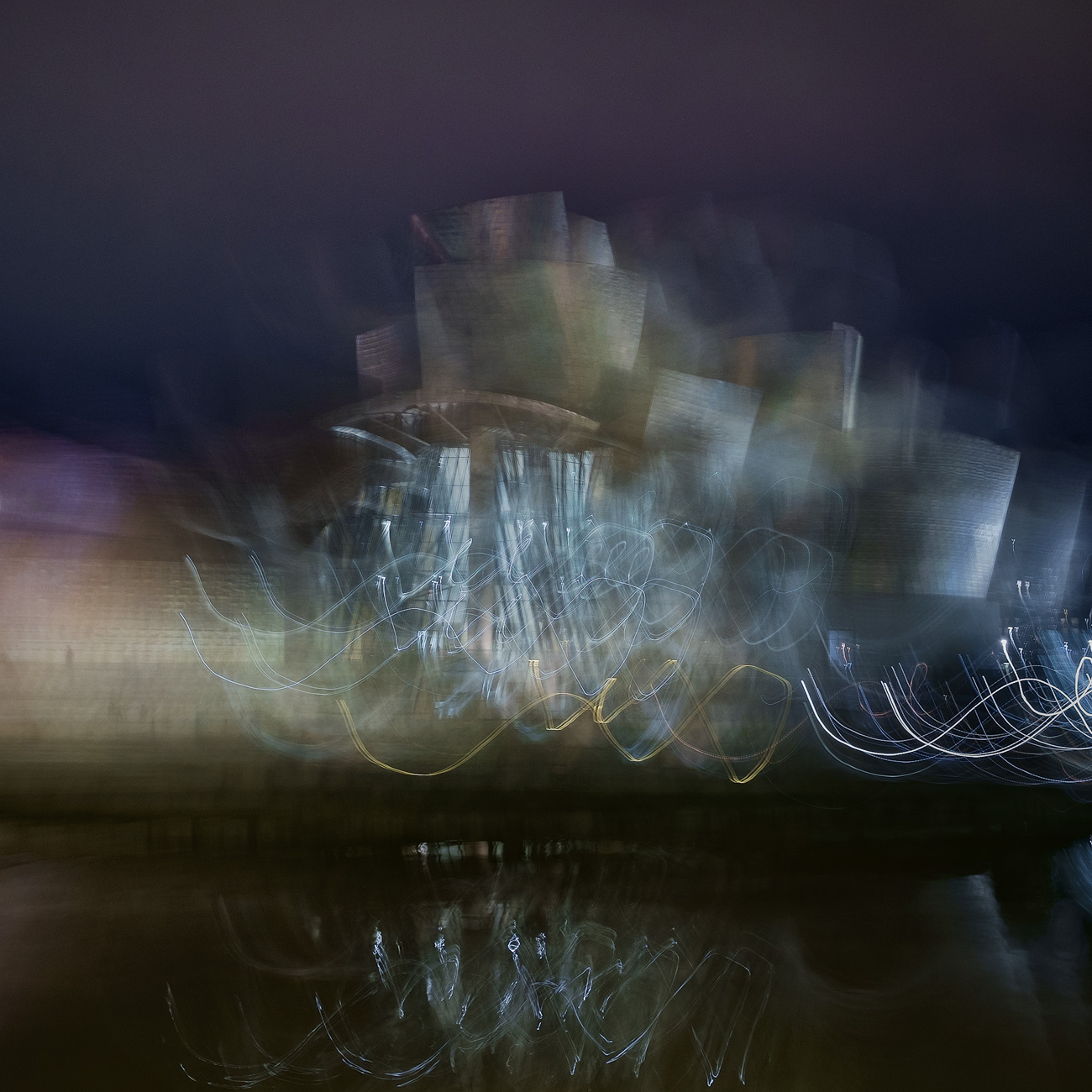
In fact it’s such a mad place, I even felt tempted to try and bit of ICM and multiple exposure at times - fairly out of character - and you could argue that the place doesn’t need any embellishment! That said, I think the craziness of the place is open to interpretation and lends itself to some alternative techniques as well as good old traditional ones. I certainly enjoyed a bit of experimentation and even quite like this particular result!
You’ve probably gathered by now I’m a bit of a Guggenheim Bilbao fan! I just loved it! It has so much scope for the photographer and for anyone that loves architecture, art, design… If I had to single out the one aspect I found most visually pleasing, though, I am in no doubt it would be that wonderfully delicate yet tough titanium exterior. The way it reflects light and colour, the combination of curves and lines - the design just works!
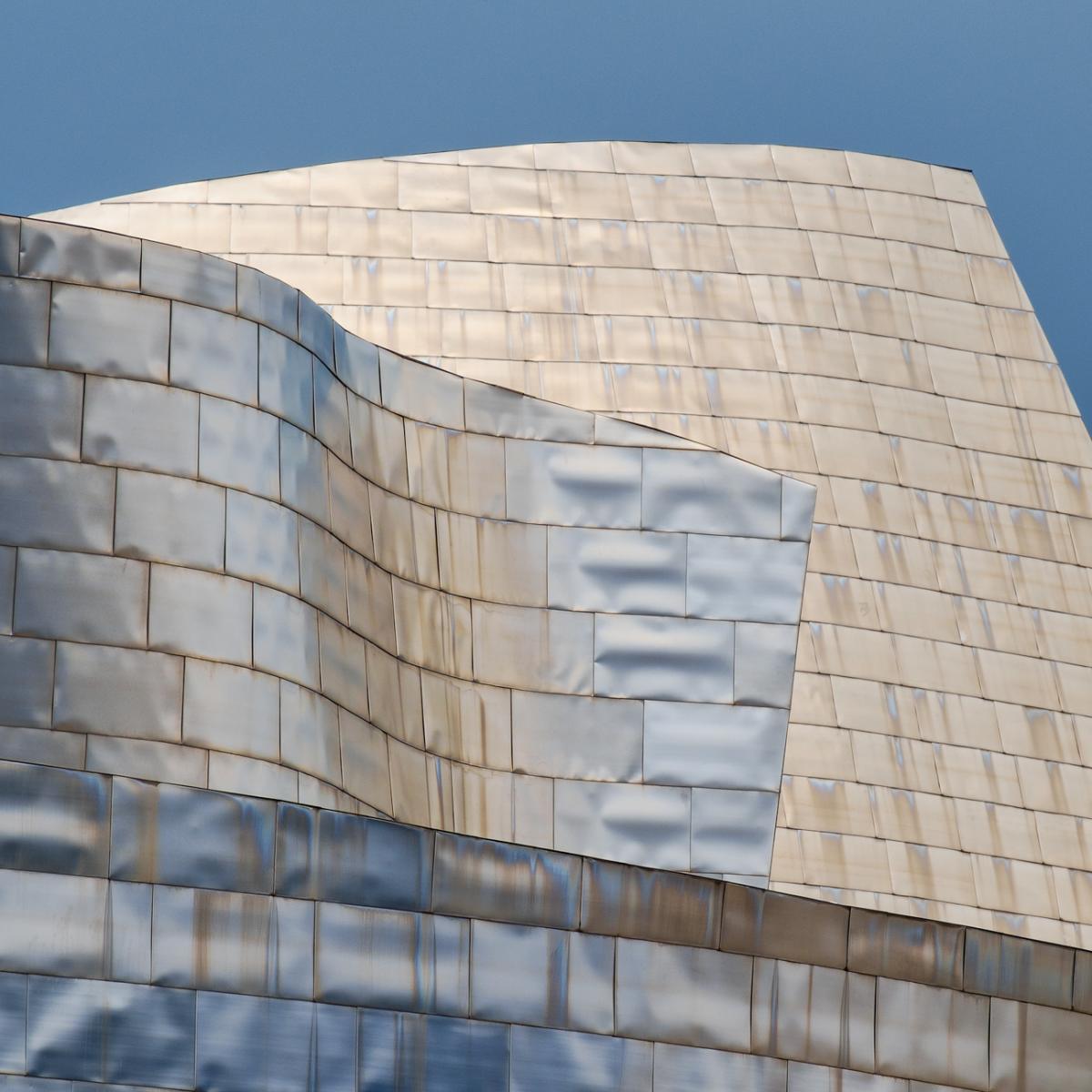
On our last afternoon, just before it was time to pack and go, I was incredibly lucky to catch the Guggenheim in some inter-downpour sunlight - the best kind of light for a building like this and it was set off perfectly by the steely blue/grey sky. A few minutes later and it was gone, and the downpour recommenced.
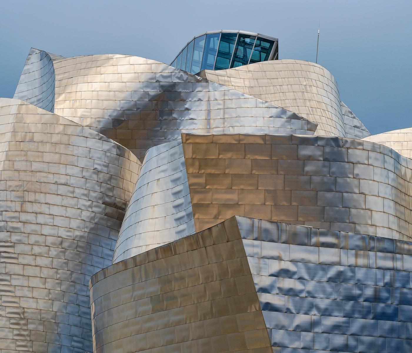
I could definitely go home happy after that wonderful display of light! Next I will do a blog about some of the lesser jewels that make up Bilbao. You can now see this blog here. I am also thinking very seriously about offering a photo workshop to this fascinating city - I will need to do more research but I would anticipate holding such a workshop in early December 2015. If you think you might be interested, please do give me a shout - but more details will follow in the New Year.
