Calibrite Photo Kit review
Posted on 4th February, 2025
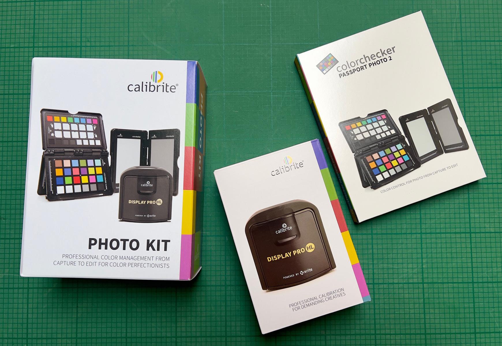
At the turn of the year the kind folks at Calibrite sent me a Calibrite Photo Kit to try out. This consists of two items – a screen calibration device and a camera profiling device. Having been producing my own prints for the best part of 20 years now, I’m well aware of the importance of having a colour managed workflow and have used various screen calibration devices over the years, but for some reason, I had never really considered calibrating my camera (and lenses) in the same way. All I can say is it’s never too late to learn! I am well and truly converted and will demonstrate why a little further on, but first, I’ll give a brief outline of my findings with the screen calibration process.
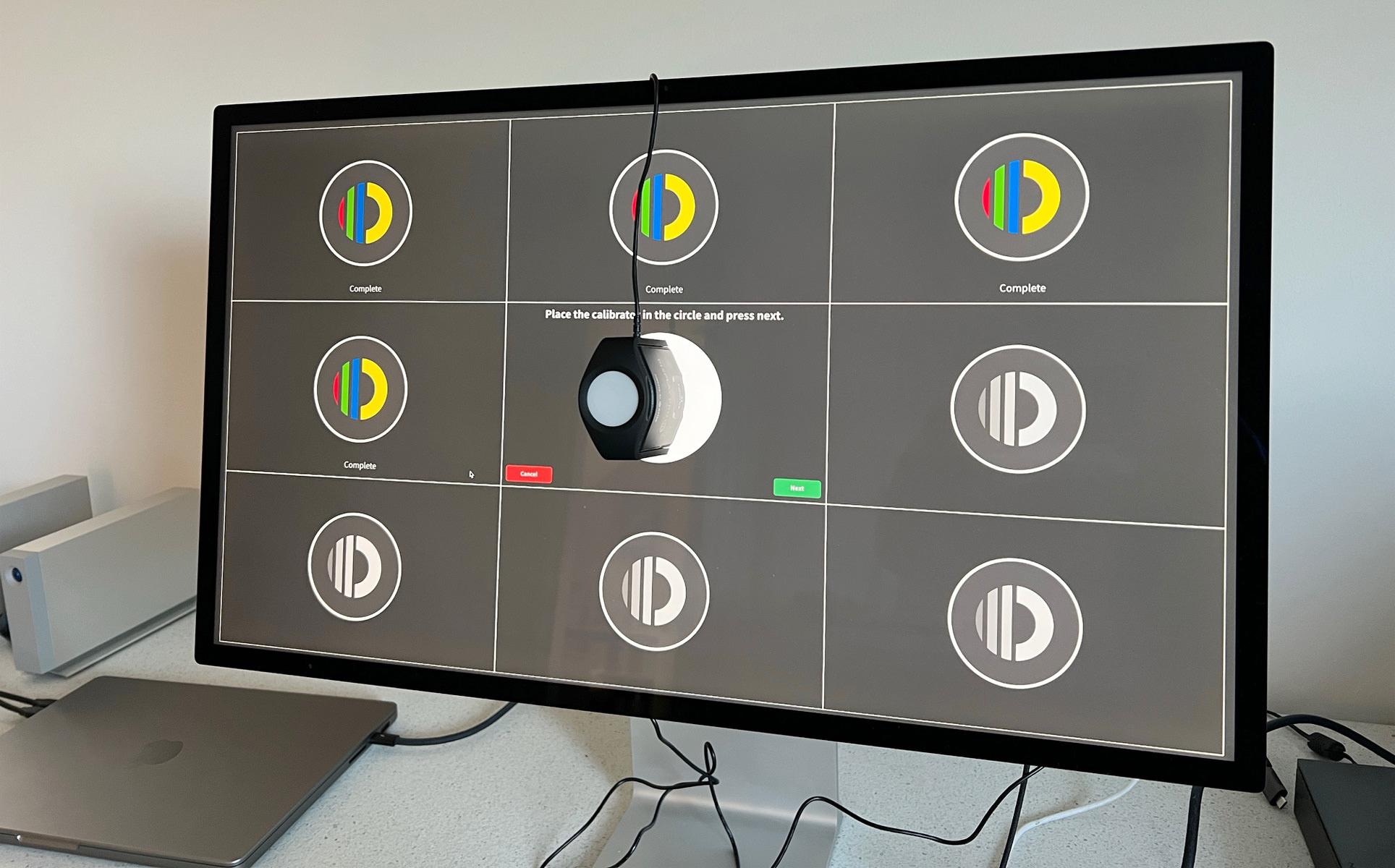
I was particularly interested to try the Display Pro HL with my Apple Studio Display and M1 Macbook Pro as my own, older calibration device could not profile either screen to my liking. The Photography preset on the Mac displays does get you very close to a ‘correct’ profile, but the reassurance and extra accuracy of a properly calibrated screen is preferable.
The Display Pro HL comes with a little pouch to protect from dust and a USB-C to USB-A converter – both nice and useful touches. The software was quick to download and install and I found it completely intuitive to operate and the colorimeter is compact, nicely weighted and just sits where you want it to with no fuss. You can choose between simpler, automated calibration or various more advanced options where you can change many of the parameters should you wish. I opted to make a slight change to the luminance level and went for a slightly more detailed reading with more colour patches measured. The difference was small, but I could see a slight improvement. Whatever you choose, every step has helpful notes to explain what you are doing and why, and my screens and prints are even more beautifully matched than before.
There are a few irritating idiosyncrasies that present themselves with screen calibration and more recent Mac operating systems, particularly when using dual screens, which I won’t go into here. However, the Calibrite Profile Manager is most helpful in this respect as it allows you to go in and check that the correct profile is active and if it is not, you can make it active. With any luck Apple will address these issues in time.
So, all well and good with the Display Pro HL – it’s quick and easy to use and gives great results on my system. However, this is just one part of the kit I was sent. Also included in the box was a Colorchecker Passport Photo 2. I’ve long been aware of these little colour patches but had never thought to use one and, wrongly as it turned out, assumed it was something more useful for portrait and product photographers. I have to say it has been a revelation!
I’ve been shooting with Sony cameras for the best part of a decade now and one of my reasons for going with Sony was that I love the files their sensors produce. Soft colours, great tonal gradations and incredible latitude; but also, quite a bias towards magenta. I do like a bit of magenta from time to time, but often it is too much, and I’ve typically tweaked this using the tint slider when setting my white balance. Now, having profiled my camera and a couple of lenses, I’m seeing just how strong this bias can be and, more importantly, its effect on colour separation in certain scenarios.
 Creating the profiles is really straight forward – I watched a 10 minute video tutorial on the Calibrite Youtube channel before attempting it myself – but I was really surprised to find just how easy it is. As a landscape photographer, realistically I’m not going to be using the patches out in the field on a regular basis, although I will certainly have them with me for those tricky moments when there’s time to use them in situ. For now, however, I just wanted to create accurate colour profiles for my camera and lenses for working in the landscape.
To do this, you create a ‘Dual Illuminant DNG profile’ with the Colorchecker calibration software – or, in my case, with the plug in that it helpfully installs into Lightroom. The idea is to create a ‘one size fits all’ profile using two different light sources. For now, I’ve gone with shade and sunlight, photographing the patch out in my garden in both conditions. It’s as simple as importing the photos into Lightroom and then exporting both files at once with the Colorchecker preset to create the dual profile. Wait around 30 seconds and a pop up confirms the profile has been created and you need to restart Lightroom before you can start using it. It really is that simple.
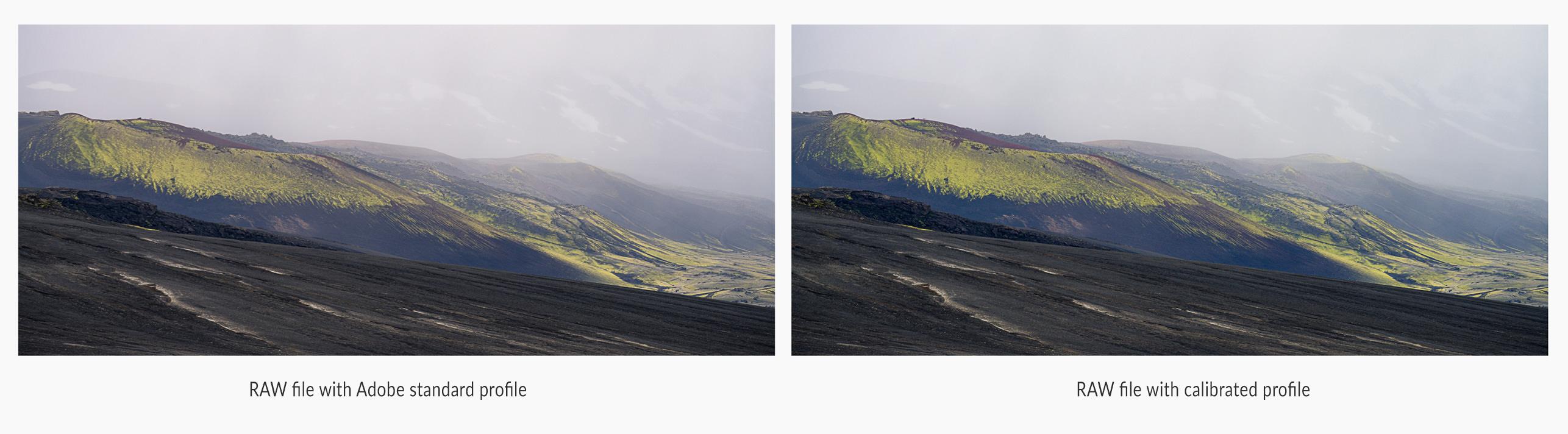
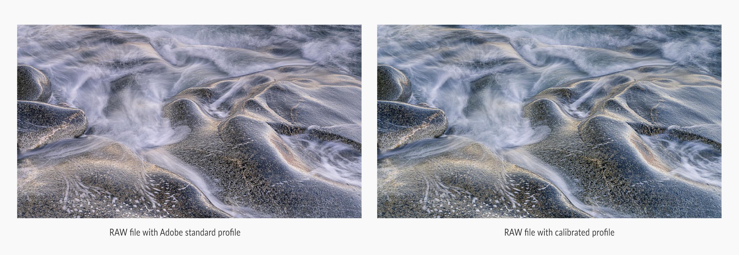
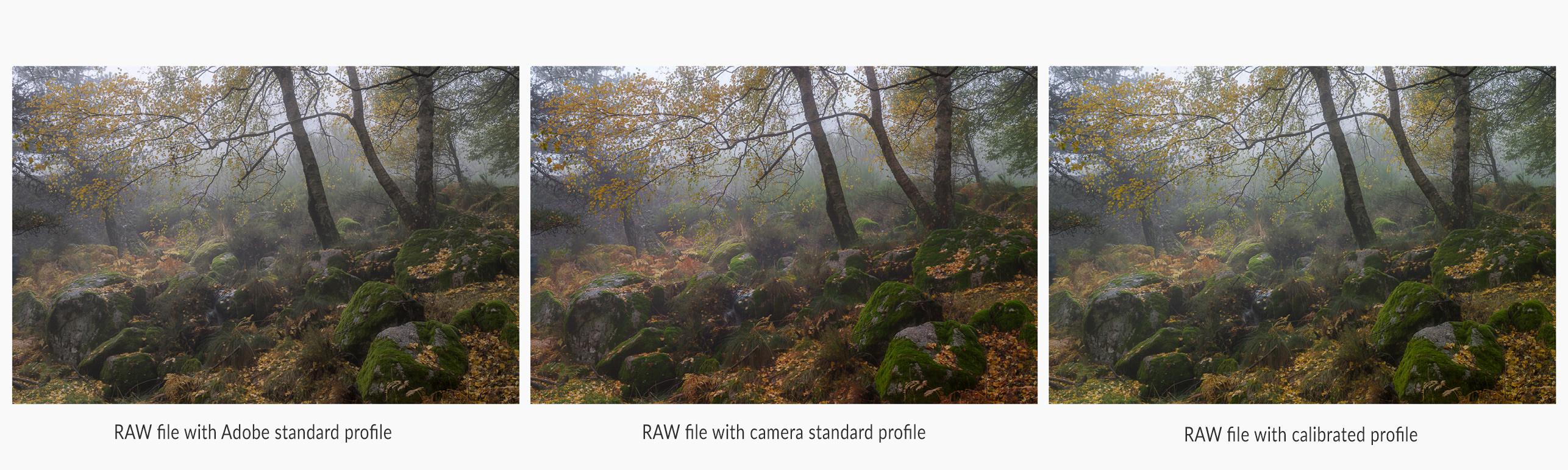 For my usual workflow, I have simply used the Adobe standard profile for the majority of my processing – I prefer the results to the camera specific profiles and have just got used to working that way. You’ll find the newly created profile/s in the profile browser, just above the white balance setting in Lightroom. I created a virtual copy of any RAW file I wanted to try out and then applied the new preset and compared the two. In some cases the difference was startling, in others a little more nuanced, and in a few instances, almost negligible. For the most part, though, the differences have been a real eye-opener for me.
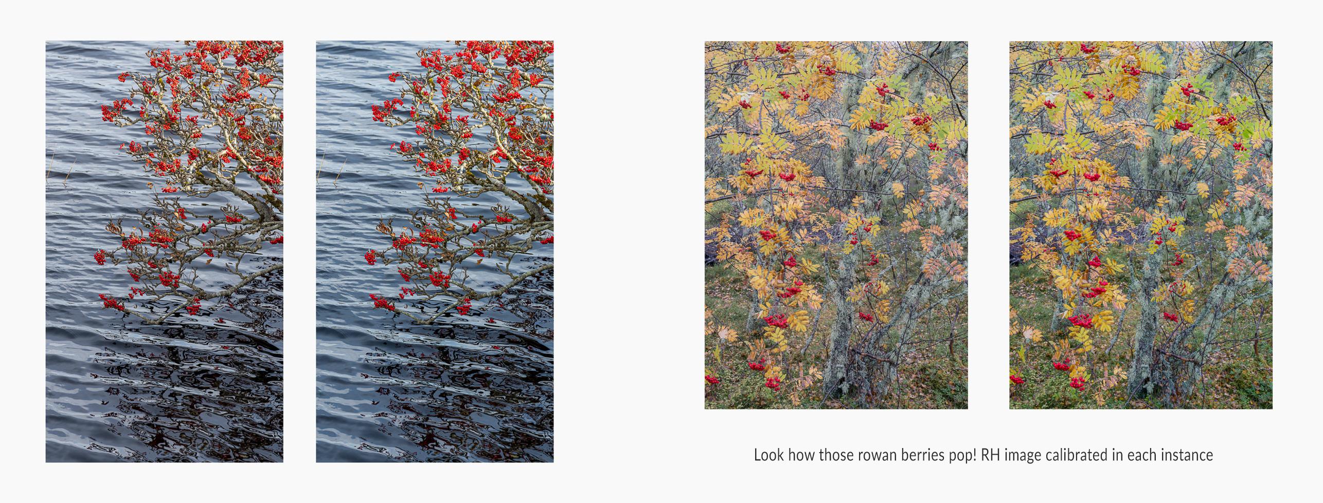
For a start, it’s nice to have confidence that what you are seeing is ‘correct’ – with all the provisos that go with talking about colour and being correct – but it’s reassuring to know that yes, that sunrise really was as crazy as I remembered, or those autumn colours as saturated as they look on screen. I’m also finding that the magenta bias on my Sony is very handily corrected, and I no longer need to adjust the tint to the same degree.
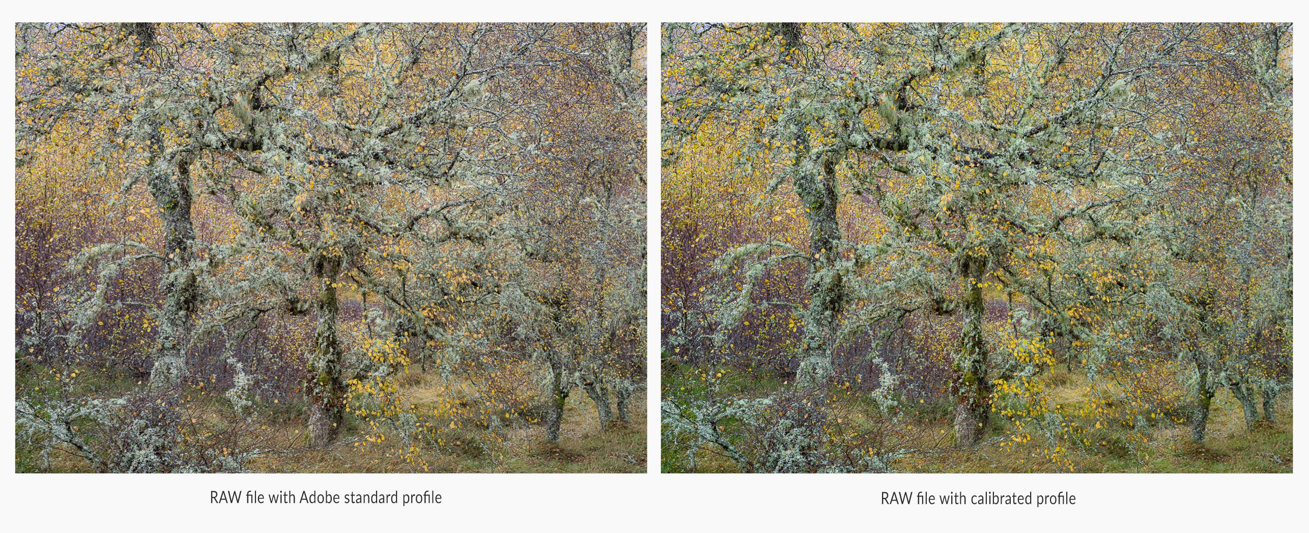 Perhaps most surprising and pleasing is what the calibration does for colour separation. As someone that loves nothing more than photographing in madly chaotic woodland, a bit of help with colour separation can make a massive difference. Another favourite subject of mine is coastal rock formations and boulders and I’m seeing a huge benefit here too. In fact, in so many areas I am finding that, with the correct profile applied, the colours just sing out much more. In some instances, this may mean me desaturating a little, particularly for more vivid greens, but I’m finding it’s a great starting point and, again, reassuring to know the colours were as strong as I’d remembered. It’s then my personal choice if I wish to tone them down a little for the sake of a balanced composition.
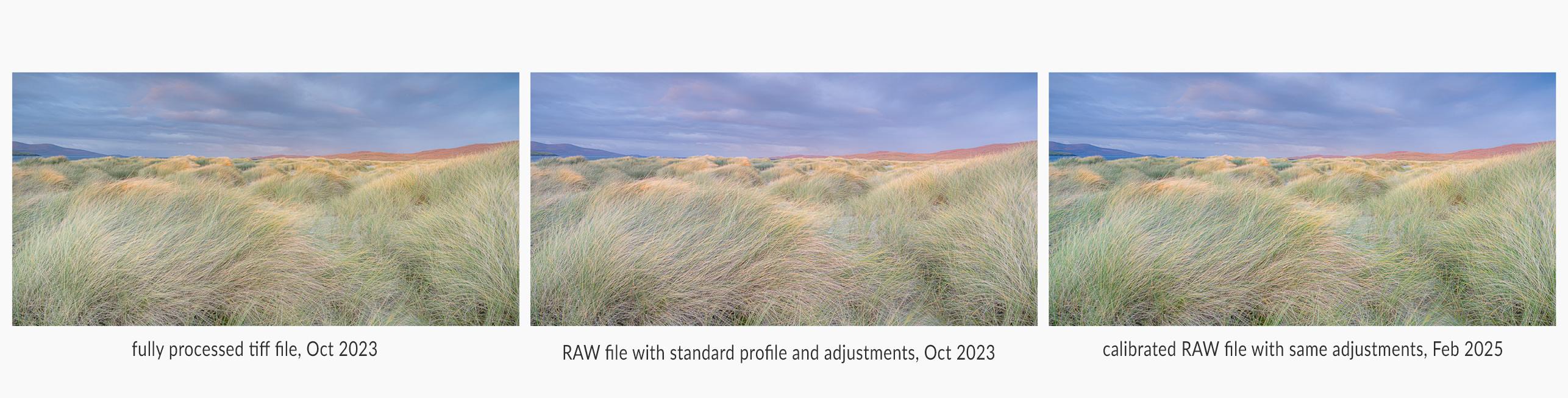
Interestingly, when I compare the properly profiled RAW file and the fully processed tiff file from my original processing of images in the past, the colours are much closer – this tells me that I will have less work to do now to get an image to look how I want it to look, because I will be starting from a better position. It’s not that I haven’t been happy with the way my fully processed photos look – I love this part of the process and pride myself on getting my images to look 'right' and have been delighted to have kind affirmation of that from many photographers that I greatly admire and respect. For all that, there’s always room for improvement and for learning something new and, if I can also get to my end point with a bit less fiddling, that must be good! ;)
 Of course there may be times out in the field, when the colour of light is particularly tricky or bizarre that I would choose to take a reading out in the field. I can also do this for white balance and exposure if I wish. What I did ascertain is that the 'Dual Illuminant' option seems to be very accurate. I tried comparing this profile with ones I took in just full sunlight and another I took in full shade and applied them to photographs taken in similar conditions. On each occasion the dual matched the corresponding sunny or shady profile, but the reverse was not true if, say, I applied the shady profile to a photograph taken in full sun. I dare say I can fine tune things further but I'm very happy with results so far and am really excited by what this little bit of kit can add to my workflow.